Designing graphics and marketing material can be a creative way to market your business. Graphic designers know how to utilize their skills in order to create captivating content for any given website. However, it is essential not to overlook the details that matter when creating compelling designs that grab consumers’ attention. Here are some common mistakes you should avoid when creating the graphic design:
Using too many fonts
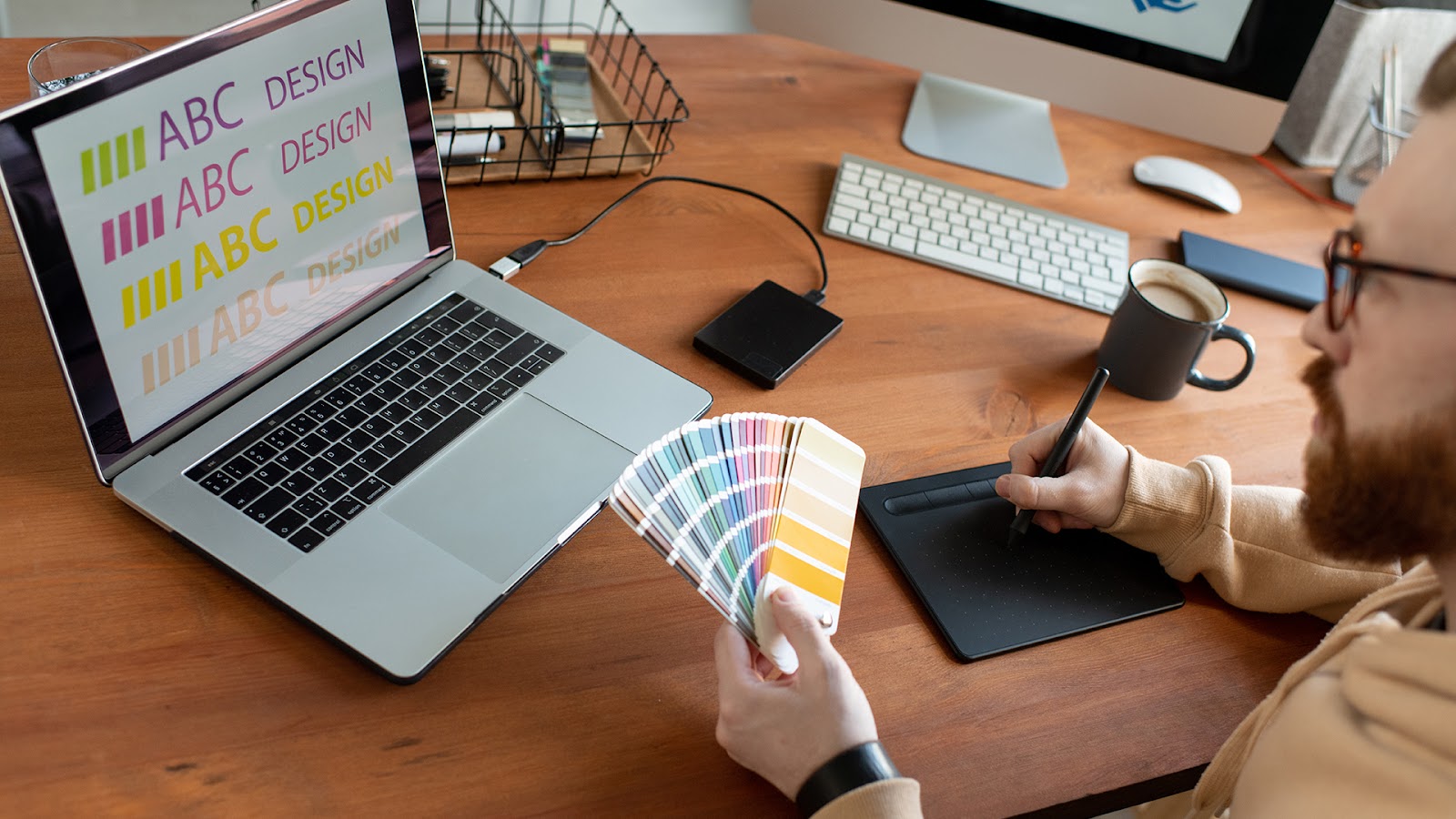
When you’re designing, it’s important to limit yourself and your content. Too many fonts or too much text can be a headache for viewers when trying to understand what exactly they are looking at. In fact, using one style of font is all that is necessary since the logo above has created continuity with just that one simple typeface. Make sure not to forget about size when choosing how many fonts will work on any piece: smaller pieces like logos only support 1, while larger ones have more freedom (like websites).
Moreover, when making a font for your art, make sure to pay attention to the spacing between letters. This is where kerning comes in and helps with legibility. Kerning makes it easier on people’s eyes when they read words because there isn’t too much space or too little space around each letter, which can be confusing sometimes if done wrong.
Failing to use colour effectively
A common mistake made while graphic designing is to choose too many colours. For example, using bright red text on a dark blue background can not only be difficult to see, it can also be confusing since it doesn’t fit the palette or mood you’re trying to convey. Instead of choosing random font sizes, fonts should suit their colour scheme – research different serifs (font types) that look good together before applying them all in one piece. Using complimentary fonts, when done correctly, can give you a stylistic leg-up against your competition.
Using Stock Images

Stock images can be limiting when you want your project to seem professional and unique. Since they have been used repeatedly it makes it easy for people to know that these aren’t original pieces created by you. To avoid this problem, make sure the watermark has been removed or purchase high-resolution versions, so no one knows any different.
Using the wrong Hierarchy

Successful Graphic Designers use hierarchical techniques such as font size and placement to communicate essential elements with their audiences. Hence, they know which information takes precedence over other pieces of data within a given workspace (beginning sentence). Whether sharing key dates like sales periods or events – where fresh content might need updating, hierarchical organization dictates what messages are most significant for readers.
Designing for the Wrong Medium

Before you begin work on artwork, it is essential to decide what type of media will be used. For designs that would appear in a print medium such as posters or magazines (which use CMYK colour mode), ensure that the colours are printed using cyan & magenta and, yellow & black ink. This means four-colour process printing. If it’s going to display digitally like TV screens (requires RGB colour space), use red/green/blue light components – i.e., digital images.
Saving in the Wrong Format

The choice of file format is mainly contingent on whether or not the image needs to be in a raster (pixel) or vector form. Rasters are made up of pixels, while vectors consist primarily of geometric lines and curves that can scale infinitely without loss in quality. It’s important to note that these files may come from Adobe Illustrator as well. If you’re concerned about an image getting pixelated upon scaling, remember a rule for thumb: make your design more significant than it actually needs to be because rescaling will reduce resolution but never improve it.
There are a few different images you can use when uploading to the web, so here’s what each is best for.
JPEG – JPEGs support gradients and help reduce file size via compression.
PNG – PNGs do not lose quality during editing like JPG files while allowing transparency in your image. This means that any background colour will show up behind the object on top without taking away from its appearance.
GIF – GIF images have small file sizes with support for animation.
Ignoring the importance of spacing

Spacing is a massive part of graphic designing, and it’s essential to make sure you use the proper spacing techniques. Spacing issues can leave your design looking unprofessional, so be careful! There are many different ways designers space out their designs using tools like letter spacings or negative spaces around each word. Examples include keeping similar letter spacing throughout and having consistent gap sizes between words when they run together in text blocks.
Looking for a professional graphic designer? Try Out Origin! Our team of creative professionals can design anything you need, from new logos to unique advertisements. Request a free quote and learn more about how we work with clients from all over the world.
